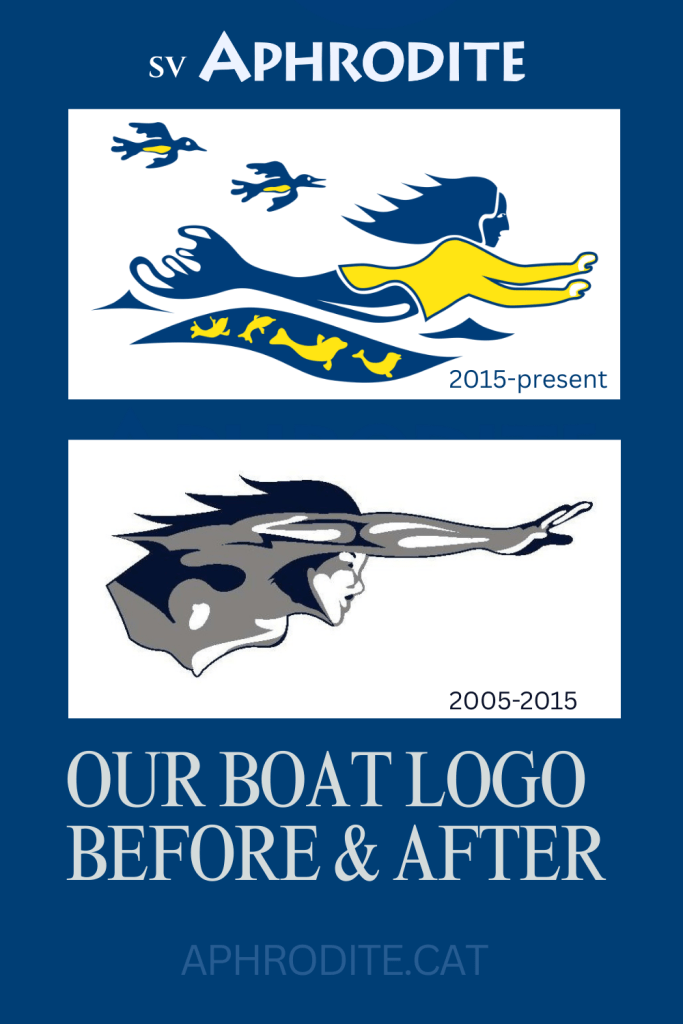
Our SV Aphrodite logo has been finalized. And, it seemed a perfect time to update the look-and-feel of my blog. The new logo was developed by Fe Wyma of Kapwa Communications. Fe developed several concepts, and after some back-and-forth, our new boat logo looks like this.
Fe refers to this mermaid creature as a Sedna.
What is a Sedna you might ask?
A Sedna stems from Inuit culture and legends of creation. We liked the tie-in to the far North as it spoke to our roots. I grew up in the Yukon. And, my husband originates from Alberta – but had done some work in Iqaluit. While he was there, he stayed in expensive, but shared accomodations, much like a dorm-style hotel room. And, with his team, he accidentally racked up a huge bill eating hotel Danishes.
But, I digress.
In creating the new logo, our goal was to preserve the original SV Aphrodite artwork while updating it with some personal features that are unique to our family.
As a reference, here is the original Aphrodite artwork, which St Francis Marine kindly provided to us.
We liked the wild hair and sense of motion that the original graphic conveyed. And, tried to preserve that, to an extent, in the new logo.
Borrowing from Inuit culture, our new logo is distinctly Canadian. The dark outlines are a nod to Canadian artist, Ted Harrison. To illustrate his style of simple lines, here is a sample of Harrison’s work.
We wanted to add some colour to the logo, and chose blue and yellow – similar in tone to the St Francis Marine logo.
And, yes – we depict our four children with harp seals. How to describe that without sounding like I’ve lost the plot? My daughter, Karen, who is the youngest of our children being the lastborn twin, told me quietly that she thought of herself as the biggest seal in the pod.
More like the biggest monkey.
Thanks so much to Fe for pulling together the concepts, and for sticking with us as we changed our minds, or scratched our heads. I am looking forward to seeing the Sedna logo appear on our boat during the haul-out that’s happening in Tampa, Florida in August.
Pin it
If you enjoyed this story, you can save it to your own Pinterest board using the image below. Thanks for reading and following our journey.


Lovely. You have put so much thought into this. When practical tasks are pulling you in all directions. so nice that there is energy and desire to express yourself artistically. the illustrations were spot on to convey the development of the logo.
LikeLike